Notes on Flesh Color in Rubens (1964)
Originally published as “Bemerkungen zur Inkarnatfarbe bei Rubens,”1 in Epochen und Werke: Gesammelte Schriften zur Kunstgeschichte, vol. 3 (Mittenwald: Mäander Kunstverlag, 1982), 165–178.
1.
The problems of human flesh color and the modes of its representation in painting, or in painted sculpture, have attracted little attention to date. This is hardly surprising wherever we find a formal approach to art history, given that the colors of human flesh indeed constitute a “natural” chromatic family only from an objective [gegenständlichen] point of view. From this perspective, “flesh color” hardly merits attention, because it is not a color defined in purely chromatic terms but is rather simply a nuance of pink, yellow, or brown. It is not by chance that flesh color plays no role in strictly abstract painting.
Within the framework of a history of style it is of course possible to investigate how the mode of representing human flesh changes over the course of a determinate historical period and within a determinate historical space. This is, for example, what Maria Grunewald does in her study of “flesh color,” which constitutes the first volume of a planned com-prehensive work on “Color in Venetian Painting.”2 She clearly distinguishes various stylistic stages, each of which depicts skin color in a different way and with different painterly means. It only follows that she aims to present her investigations in an objective manner, and treats other objects such as drapery and landscape in the same way.
2.
A question that has never yet been posed, so far as I can see, is that of the relation of flesh colors to all other colors, both in reality and in painterly representation: or, if you will, the question of their ontic or ontological meaning. One of the few who has been aware of this problem is Carus. He discusses the essential meaning of human flesh color in the real world in terms of the overarching concept of “tone”:
First, tone and color, two weighty concepts in the realm of painting! It is in fact an inadequacy of our language (although what language would serve better?) that we must here borrow a concept from the realm of the audible for the depiction of a relation in the realm of the visible. Everyone now knows that tone, in this sense, always expresses a certain mood that permeates a natural or artificial image, a certain harmony of color that commands the whole, which everywhere calibrates local coloration, or indeed in a certain sense is capable of wholly suspending the latter. To grasp the full meaning of tone, in contrast to color, one must remember that, already in the organic world, the higher and nobler the visible appearance of an organism, the less one can speak of pronounced coloration. Thus, nature distinguishes only the lower creatures with decisive, burning colors; the highest creature, man—or rather the white man; the man of the day—only possesses the fine tone of his external covering; nowhere, however, in his normal state is to be seen on him green or yellow or harsh red and blue or any other sharply pronounced particular color,3 for which reason indeed only masters of the caliber of Titian have been able to grasp the poetry of this fine coloration, such that nothing, perhaps, shows the ignorance of an inquirer into these things so well as the question once posed to a painter, while he was painting, of where exactly on the palette he kept his flesh color.4
3.
The scale of the colors of human flesh ranges from that skin color which we call “white”—it can even be called lily-white or snow-white—to that which we call “black”—or for emphasis, even ebony-black, coal-black. The names for the main types of possible flesh colors are improper [uneigentliche], indeed almost metaphorical terms, for we can only speak of white, yellow, red, or black skin in an improper sense. The only exception is the description of a skin color as “brown,” which does apply in the proper sense. Something else is strange about this terminology: in contrast to white, black, yellow, and red, brown is a mixed color, and indeed, as we shall see, a color mixed from a brightly colored and a dark component (orange-black, red-black), yet it nonetheless possesses a non-objective name: “brown.”5 This is noteworthy because for the most part it is only nuances of human skin color that can be designated by objective color descriptions: ivory-colored, peach-colored, coppery, etc. The color designation “pink” [Rosa] also belongs in this series, although its objective meaning (the color of roses) has faded away.
4.
The position of this family of colors—which is only circumscribed by the fact that they all appear as the color of human flesh—within the larger color spectrum [Farbkörper] would at first seem easily determined, but on closer inspection it nonetheless poses several problems. If we take as our ordering schema for the totality of colors a space with a vertical axis formed by the one-dimensional “line” of pure gray tones, stretching from the white pole to the black pole, and if we place the bright colors on the equator of this body, all possible skin colors would lie close to this axis, in the red and yellow interior of this field.6 Red and white produce pink, yellow and white a yellowish tone, red and black brown, orange and black other nuances of brown, and so forth. An exception is the mixture of yellow and black, which as we know produces olive green;7 there is, however, no such thing as a properly olive-green skin color, but rather only an olive-brown or olive-yellow.8
What is important to see here is that within the scale of flesh colors that we meet in nature, there is no admixture of blue or indigo, and likewise no green. The occurrence of bluish or greenish skin tones indicates a disturbance (“blue lips”), sickness (“cyanosis”) or even decomposition. Yet even here there seems to be an exception. There is no doubt that human flesh tones, especially those of “white” people, can take on a purple hue: “purple” cheeks, for example. We must therefore expand the range of possible skin colors in this direction. With purple, however, blue can intermix. Certain color theorists also consider a combination of brown and blue (blue-brown) as possible;9 however that may be, as flesh color this mixture is unreal, “unnatural.” There are indeed “white” and “black,” “red” and “yellow” and—as a passing phenomenon—even “purple” skin colors, but no blue or green ones.
The apparently so obvious conclusion that all skin colors fall within the red-yellow half of the spectrum, and are foreign to blue, must be kept in mind when we consider Rubens’s original approach to flesh color.
5.
The peculiarity of the brown, peach-colored, and related tones lies in the fact that they are capable of forming transitions between incompatible hues, each of which they contain fused within themselves.10 This property, which is accorded to them on account of their position within the total chromatic field, allows these hues to play a mediating function. The entire scale of human flesh color also belongs to this family of “tones.”
This mediating function is oriented in many directions, yet it is nonetheless a limited rather than a “universal” all-around function, given that—as must be emphasized—it is limited only to the half of the color spectrum that excludes blue.
In any case, this peculiarity produces certain potentials for the use of these hues in representational painting.
6.
In the chromatic construction of paintings, flesh colors can assume a central or primary role under two conditions.
The first condition, which is an external one, is the existence of a kind of art in which the naked human body in its natural appearance has become both capable and worthy of representation.
The second, “inner” condition is the existence of a style that is oriented towards the connection and mediation of heterogeneous phenomena, including, but not limited to, those in the field of color. That is to say, a style of the kind that Wölfflin called “painterly.” Netherlandish art of the 17th century is such an art par excellence.
The second condition is not bound to the first condition. The peach-colored, sallow, and brown hues, which have the property of effecting this chromatic mediation, need not appear on naked human bodies; these colors may instead fuse all of the objects in the painting into an overall tonality, and thus belong more to the represented space than to the represented objects. As soon as this link to the representation of human bodies falls away, the circle of these “binding” mixed tones expands, in particular with the emergence of the olive-green hues, which result from the mixture of black and yellow.11
7.
In Rubens, the color of fair—“white”—flesh is comprehended as the epitome12 of the three primary colors (red, yellow, and blue), indeed in a sense as the epitome of all colors, and at the same time as the highest expression of light in the realm of color. Shimmering like mother-of-pearl, chatoyant, iridescent, opalescent, the color of fair flesh appears as a synthesis of the most finely differentiated red, yellow, blue, and white (or light gray). The basis, here, is the mixture of red and white—that is, a pink—from which the red often stands out strongly, especially at the edges. (“His flesh is like the redness of fingers held against the sun,” as Winckelmann aptly, indeed insightfully noted.)13 An admixture of yellow or even light gray results in a peach tone; so far, everything is still “natural.” Unnatural, however, is the addition of a bluish tone, which one can immediately pick out of the totality of the flesh tone mixture. It has no objective or representational meaning whatsoever; it stands neither for the blue of translucent veins nor for bluish shadows, but is rather present only because Rubens both saw and understood the color of human flesh as the epitome of the three “high,” “pure” colors.
This peculiarity of the typical pale flesh color in Rubens has often been remarked. I seem to remember that Waagen saw and described it, although I can no longer find the reference. Eigenberger has emphasized it. I myself offered an interpretation in a lecture at the University of Vienna in the summer semester of 1940, and most recently Florian Furtwängler, in a just-completed dissertation for the University of Munich, has independently drawn attention to it.
The observation only reveals its value when we consider the consequences that result from this understanding of flesh color.
8.
An art of painting that understands human flesh as the epitome of the three primary colors by this very fact accords the human being a central position in the chromatic cosmos of the world, purely as a phenomenon of color—strictly speaking, a “more important” position, as a phenomenon of color, than nature accords to the human. In purely chromatic terms, such painting is already anthropocentric painting. Purely in terms of color, that is, the human being is already potentially everything: “homo est quodam modo omnia.” This understanding of color in Rubens implies the maximum glorification of the human body as a phenomenon of color.
Thus understood, flesh color holds within itself the potential to extend in all directions, into the world, to relate and ally itself to all colors, above all to the three primary colors that it contains. A magnificent example is the painting of Cimon and Iphigenia in the Kunsthistorisches Museum, Vienna. Each of the three female nudes shimmers like mother-of-pearl, thanks to the mixture of the three primary colors, yet each is oriented in a different “direction,” towards one specific, vivid color: the tonality of the nude on the red fabric clearly tends towards reddish, that on the orange fabric towards orange, and that on the blue towards bluish. (Cimon’s brown flesh color, by contrast—visible only in his face, hands, and feet—relates to the simple colors of the earth, about which there will be more to say below.)
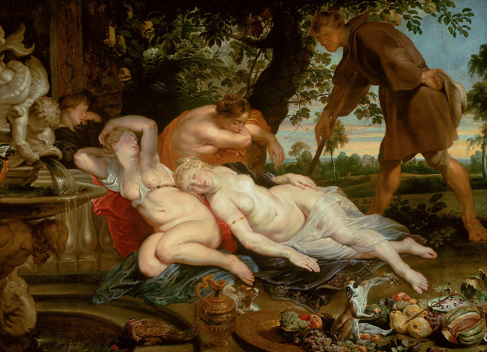
This binding power of light flesh tones can be observed, albeit less pointedly, in countless other examples, quite beautifully for example in the Rape of the Daughters of Leucippus in the Munich Pinakothek: just one example that must stand for many.
Light flesh color in Rubens contains all chromatic possibilities in potential within itself; in this sense, it is pantochromatic.
In Rubens, the colors of the human body thus accomplish what in contemporaneous Dutch painting is accomplished by the brown, brownish, sallow, off-white, and olive tones of space, of the objects in space, and of chiaroscuro: that of binding everything together [das Allverbindende].
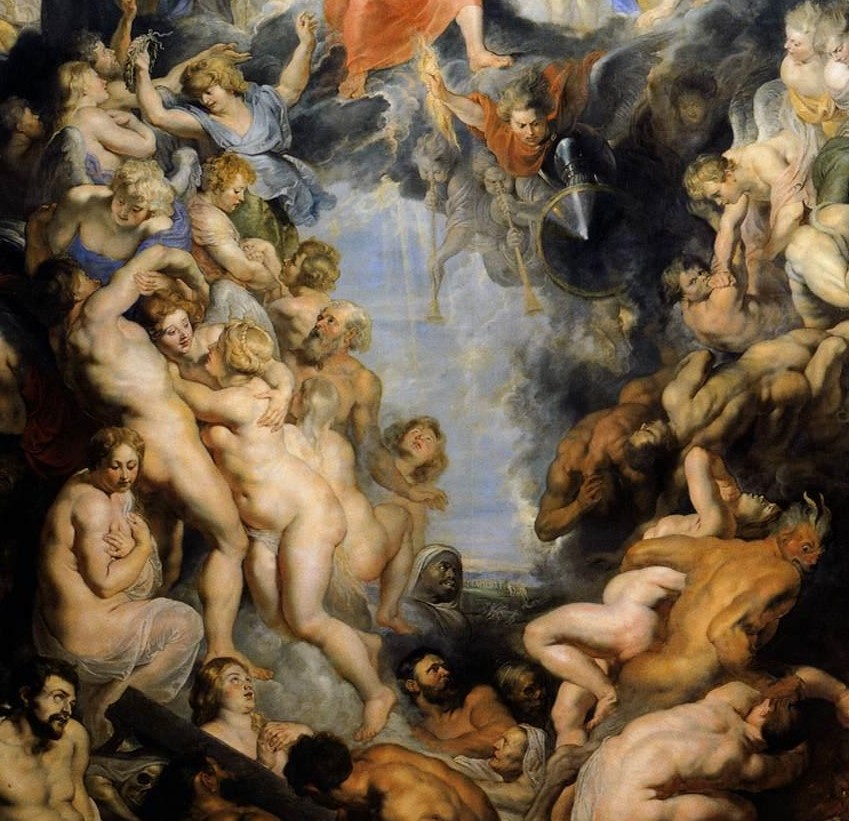
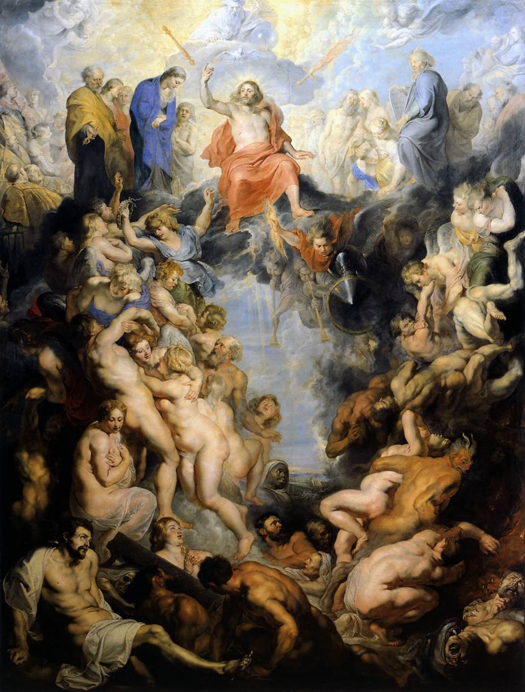
Because flesh color occupies this central position in Rubens’s art, entire pictures could be composed out of its various shadings without any need for more vivid colors, given that the latter are indeed already contained within the flesh tones. A picture so composed pre-dominantly out of flesh colors is thus anything but monochrome; it is rather—and not only potentially—pantochrome, all-colored. Think only of the Small Last Judgment. In many other pictures, too, flesh color in all its natural graduations is predominant, without however being exclusively dominant. It is capable of drawing forth from itself the intense colors of which it fundamentally consists: as, for example, in the Battle of the Amazons in Munich. Brown flesh tones carry the picture. As is well known, however, brown is a mixture of red and gray (red and black), and hence pure red and pure gray surface at crucial points in the composition. But blue, as well, which is added to the flesh color in imperceptible traces, can free itself from the mixture to manifest in the gray-blue of certain clouds.
This coloristic “universality” [Allseitigkeit] of the flesh tone opens the door to unpredictable chromatic developments, combinations, and contrasts. There is in nature hardly another color that is capable of achieving the same, unless it be the indefinable fusion of colors in mother-of-pearl—for which reason it persistently offers itself as a point of comparison—and then, perhaps, the soft and iridescently shimmering colors in the plumage of some birds, or the scales of some fishes and creatures of the deep sea. And most frequently, perhaps, in the coloration of clouds in specific lighting.
Like these, Rubens’s flesh color in a certain sense transcends the chromatic possibilities of the natural world.
9.
All of the world’s possible colors order themselves around this “central” color synthesis of the flesh tone as a meaningful chromatic-objective cosmos.
First of all are the colors of simple nature. The basic colors are: gray (stone)—brown (earth)—green (vegetation). All three are “middle” colors. Gray is the mediation between the non-color poles of white and black. Green is the mediation not only between the bright colors yellow and blue, but also between the bright shades among the colors of light and those belonging to darkness. Yellow and red are light cloaked in darkness; blue is darkness cloaked in light. Between them stands green. “It is indeed evident that green does not only stand between yellow and blue, but also that it constitutes the dividing point within the entire continuum” (that is, of the bright colors). “In it, the scales are balanced, so to speak: here is the center of gravity, on either side of which the scale slopes away to the right and left. Since the light, positive colors stand on one side and the negative colors of darkness on the other, it would seem that green partakes equally of both principles, the principles of light and darkness,”14 just as gray, as a middle tone, partakes equally of white and black. Their “mixedness” notwithstanding, however, both gray as well as green are no doubt independent colors, as well.15
There is an “ontic” symbolism in the fact that it is precisely these three “middle colors”—gray, brown, and green—that are the typical colors of the earth’s stony foundation, of the soil, as well of wood and vegetation. “How could it possibly—objectively!—be mere chance that the color of purely vegetative being is green? The fact that chlorophyll, which is necessary for photosynthesis, contains a green pigment explains nothing, in this sense. If it were possible to gaze more deeply into the inner essence of nature—and not only into the factual conditions of its existence, conditions that can be demonstrated through experiment—we would no doubt find that chlorophyll’s distinctive utilization of light in the photosynthesis process is such that it corresponds precisely to the manifestation of the color green.” On the deeper grounds of the relation between vegetal being and the color green—that color in which light and darkness stand in tranquil balance—I refer the reader to Hedwig Conrad-Martius.16 The same applies mutatis mutandis for brown and gray.
This constitution is however the ground of the peculiar “sensuous-ethical effects” that these colors exert. “The incomparably calming and stilling effect of green immediately reflects the calm balance and immanent moderation of vegetal nature as such.”17 Likewise, the effect of restful security flows from the essence of the color brown: it is the color of Mother Earth, of sap-bearing wood, of the protecting bud, of the monk’s cowl.
10.
For Rubens, the strong, saturated, bright colors of the chromatic cosmos are by contrast “decorative,” in the highest possible sense of the word. These are the colors of the blossoms that adorn plants; the colors of the plumage with which birds are adorned; the colors of human garments, with which humans also adorn themselves. And in every case they signify “abundance.” In the Munich Madonna in a Garland of Flowers, the red and blue in Mary’s robe have the same ontic function in relation to the color of her flesh as do the red and blue of the blossoms in relation to the green of the plants in the wreath.
For Rubens (although of course not only for him!), human garments are the bearers of great expanses of bright color. Alongside the pantochrome flesh tones and the mesochrome (middle) colors of nature, they constitute the third great circle of color through which the objective world in Rubens presents itself as chromatically well-ordered, as a “cosmos.”
Yet: within the framework of an art of painting that respects the “real” colors of things, vivid garments are the only colors that nature does not dictate, but which rather can be freely chosen within a picture that has already been objectively planned and objectively laid down. They enable a chromatic composition that is independent from the formal composition: they make it possible for the artist to compose with the inherent values of colors, as well as with their semantic and expressive values.
In pictures by Rubens there is a proportion between colors that are objectively determined (and thus only variable within specific limits) and colors that are fully (or at least to a high degree) freely chosen. To be sure, however, this applies not only to the art of Rubens but rather to the entire tradition from which his art emerges.
11.
In Rubens, the world of colors thus lightly and without pedantry orders itself in three circles which are not, however, somehow isolated, but which rather make contact with each other, such that we can think of each as overlapping and exceeding the next.
The integration of the color trio red-yellow-blue, together with white (gray), con-stitutes the central circle, Rubens’s pantochromatic light flesh color. Brown flesh tones, which do not have this universal character, relate to the colors of the second circle: to the brown of the earth, of earthly creatures, etc.
The trio of the “middle colors,” gray-brown-green (as well as olive green), in all their various shadings and transitions, constitute the second circle. These are the colors of what is straightforwardly terrestrial. To these belong the colors of the fruits of the earth, the fur of animals, etc., etc. It is evident even at first glance that in chromatic terms the human being stands above this sphere. The colors of horses occupy a certain middle position between these two circles, as indeed the horse is likewise accorded an exceptional position in proximity to human beings in the thinking of the era.18
The third circle is composed of the bright “autochromic” colors, to which should be added black and white. They can appear as independent essences—not only red, blue, and yellow, but also the bright mixed colors: orange, violet, and green. Or they may break out from and thus transcend the simple earthly mixed colors: from gray comes black and white; from green, yellow and blue; from brown, black and red, or black and orange. These vibrant, saturated colors are the colors of magnificence: the magnificence of flowers in bloom, the magnificence of birds in full feather, the magnificence of human beings in their draperies, etc. Such colors are a moment in the self-presentation of these beings in the highest fullness of their life.
Naturally the typical colors of the second sphere can also appear in the third: there are also gray, brown, and green garments, even if they appear less frequently. Almost inevitably in Rubens’s works, as in the reality of his time, the gray or brown of an item of clothing signifies humility (see, for example, the ungainly peasant Cimon in Cimon and Iphigenia). Green clothing only appears very infrequently in Rubens, and then it almost always has a heavy character; its bearers are often weighed down with strenuous activity.
Representations of architecture have a quite particular position with respect to the three circles. The tones reserved for architecture are closely related to those of the flesh colors, and indeed can practically take on a flesh color, as for example the castle in the small park scene in the Kunsthistorisches Museum, Vienna. Here, too, there is an interplay of gray, yellow, and pink within an indefinable overall tone. This is the visible equivalent of the fact that architecture is here conceived as bodily, anthropomorphic, as akin if not related to the human body.
12.
The light flesh color is for Rubens not only the epitome of the chromatic, but is also, in the realm of earthly bodies, the epitome of light. Certainly, pure white is “brighter” [heller] than the brightestflesh tone, but the flesh tone is lighter [lichthafter].
We perhaps understand this best once it becomes clear that blond human hair is the highest approximation to the “color of light” as such, as it appears within the earthly realm: gold-yellow, the chromatic equivalent of gold. The lightness of “golden” hair is nowhere so convincingly realized in painting as in Rubens. This “gold” of the hair, however, is closest in lightness to the mother-of-pearl of fair human bodies, and both are found united in countless of Rubens’s nudes.
Both are the bearers of a curious brilliance or shimmer.
This observation does not apply only to the “light” flesh tones. Neither does it imply an ethical denigration of dark flesh tones. In the picture of the Four Continents in Vienna, the entire spectrum of flesh color is beautifully and equally developed from the brightest iridescent peach to the deepest brown-black. And this scale here stands “above” the rich modulations of the gray, brown, and green tones of “lower” nature, to which is also appended a work of human stonecutting. Here and there around the bodies the strong colors of bright draperies flare up: red and blue.
13.
In order to represent the entire world, this earthly cosmos of color is in need of expansion into two further regions: the supernal/heavenly and the subterranean/infernal realms.
Regarding which we can say the following, grosso modo:
Even in its earthly mode of appearance, Rubens’s generally whitish “sky blue” is free from any earthly mixed colors: brown and green are not present in it. And especially not in heaven. The “middle” realm of colors thus falls away here: what remains are the two “upper” circles: the realms of the flesh colors and the vibrant colors, as well as the primary colors, but here transfigured and sublimated towards white. Blue, red, and yellow, the primordial colors, emerge draped in white, in heavenly garments—these are, however likewise the colors of the earthly sky in its various modes of appearance, whereas the appearance of green in the sky is always unnatural. Drawing no less close to sublimation into heavenly white is the synthesis of these colors in the flesh of transfigured beings. The closer they are to the empyrean, the more these colors lose their specific chromatic character and become alike: whitish pink, whitish blue, and whitish yellow come to resemble each other.19 But it is precisely this that is already prepared in the synthesis of Rubens’s flesh tone. Hence it may perhaps be said, with all appropriate caution, that a transcendence of the earthly realm of colors is already inherent, in purely chromatic terms, to the light human flesh color that Rubens “invented.” On the other hand, “heaven” thereby appears not as purely supernatural, but rather as a “lighter” version of human nature.
This approach was to enjoy a long afterlife. In the parting of the heavens that Tiepolo stretched over the stairwell of the Würzburg Residence, what we see objectively is the figure of Apollo, the god of light; chromatically, however, we see the flesh color of his naked body. And out of this body, so to speak, unfold in a single breath the draperies of the genii that surround him, and in these, the three primordial colors—red, yellow, and blue—that are born out of the “color of light.” The color of light, however, is not white, but rather the color of the “light” human body. Here Tiepolo repeats the principle of Rubens.
It only follows that the infernal region is, in chromatic terms, a darkening. “Darkening,” however, means that the black, blackish, sooty, and smoky tones appear as if from outside, as something not immanent to the colors themselves and, above all, as something abysmally distant from the light flesh tone; it disfigures human and infernal bodies with smoldering discoloration. The colors of burning fire are the earthly equivalent of the chromatic quality of hell, just as the light flesh color represents an intimation of the chromatic quality of heaven. Here we may recall that for Rubens the inhabitants of hell are human beings deformed into the animalistic or monstrous, and that the human is also not entirely lost in this deformation, whereas in the far more profound pictures of hell by Bosch these creatures arise from the unlimited fornication of all realms of being. The colors of hell thus also have an entirely different substantiality in Bosch.
14.
I am aware of the inadequacy of these sketch-like notes. They are indeed consciously limited to a single point of view, a field of vision in which Rubens stands alone, and even then only the “typical” Rubens; I have provided no account of the transformations of his art. His exceptional position would only become fully apparent after an inquiry into the peculiar relation between the flesh tone and the remaining colors in the work of other masters. Titian and Veronese are especially worthy of further research. And yet it seems to me that even from this single point of view a particularity of the art of Rubens emerges with surprising clarity: the chromatic glorification of the human body as lumen naturae and earthly mirror of heaven.
More important to me than the result, however, is the standpoint itself, which—if I am not mistaken—has to date never yet been taken up in the history of painting, in the history of color and light. One might name what becomes visible from this position the “ontic” or “cosmic” aspect of colors, and thereby also name the problem: to allocate the universe of colors to the various realms of being, in reality and in its representation in painting’s various historical stages.
- 1 [Translator’s note: The title of Sedlmayr’s essay is to an extent untranslatable. Although on a literal level Inkarnatsfarbe simply means “flesh color,” it evokes the Christian Incarnation, that is, Christ’s becoming flesh. Sedlmayr modulates easily between the words Inkarnat, Inkarnatsfarbe, Karnation, and Fleischfarbe, all of which strongly connote flesh, whereas he only occasionally employs the terms Haut or Hautfarbe to specifically emphasize skin.]
- 2 Maria Grunewald, Die Karnation (Berlin: Bruno Cassirer, 1912). [Translator’s note: Like Sedlmayr’s Inkarnatsfarbe, the terms in Grunewald’s work convey nuances lacking in any available English equivalents. “Carnation” is in fact an older English word for flesh color in painting, but it seems to have entirely vanished from the more recent literature (though it survives as the name of a tincture in heraldry—specifically, a pinkish or tan color). “Carnation” and die Karnation are further echoes of the Incarnation. The title of Grunewald’s larger planned work is Das Kolorit in der venezianischen Malerei. Grunewald’s Kolorit is a cognate of the French coloris, a term with its own rich literature (note, especially, Roger de Piles’s 1673 Dialogue sur le coloris).]
- 3 The fact that in C.S. Lewis’s novel Perelandra the Great Mother—the Eve of the planet Venus, so to speak—has green skin, although otherwise of fully human form and nature, emphasizes the quite different mode of being of this extraterrestrial vegetative world.
- 4 Carl Gustav Carus, Betrachtungen und Gedanken vor auserwählten Bildern der Dresdner Galerie (Dresden: H. Burdach, 1867).
- 5 Cf. Mohammed Rassem’s text in: Rassem and Hans Sedlmayr, Über Sprache und Kunst (Mittenwald: Mäander Kunstverlag, 1978), 63.
- 6 [Translator’s note: Although Sedlmayr does not provide an illustration of his Farbkörper (literally a “color-body”: another corporeal term), his description recalls Philipp Otto Runge’s 1810 Farbenkugel, or color sphere, which likewise features a white-to-black vertical axis as well as a ring of pure colors around the equator.]
- 7 The so-called “second green.” See: A. Bernays, “Versuch einer neuen Farbenordnung,” Vierteljahrschaft der Naturforschenden Gesellschaft Zürich 82 (1937), 161–196. This had earlier been observed by Goethe (in the didactic section of his Farbenlehre) and experimentally investigated by K. Oesterreich (Zeitschrift für Sinnesphysiologie, 1928, 356–ff.).
- 8 One need not point out the shortcomings of this schematic ordering of the colors. It has proven useful for our purposes.
- 9 See Heinrich Frieling’s color pentagon in his book Die Sprache der Farben. Vom Wesen des Lichts und der Farben in Natur und Kunst (Munich and Berlin: Oldenbourg, 1939), reproduced in: Wolfgang Schöne, Über das Licht in der Malerei (Berlin: Mann, 1979), 228.
- 10 J. v. Allesch, Die ästhetische Erscheinungswelt der Farben (Berlin: Springer, 1925).
- 11 On the meaning of these tonal series of gray, olive green, and brown for the overall effect of typical chiaroscuro painting, and as constitutive elements in chiaroscuro colorism, see: E. Strauss, Hefte des Kunsthistorischen Seminars der Universität München 5 (1959), especially page 3.
- 12 [Translator’s note: Sedlmayr’s word, Inbegriff, could also be translated as “embodiment,” although here, for once, the corporeal implication is misleading; etymologically, Inbegriff rather connotes conceptuality (Begriff means concept, notion, or idea).]
- 13 Johann Joachim Winckelmann, “Essay on the Beautiful in Art” (1763), trans. Susan Powell, in: David Irwin, ed., Winckelmann: Writings on Art (New York: Phaidon, 1972), 101.
- 14 Hedwig Conrad-Martius, “Realontologie. Licht und Farben,” Jahrbuch für Philosophie und phänomenologische Forschung 6 (1923), 284–288, 366.
- 15 Wolfgang Schöne, Über das Licht in der Malerei, 229-230. Quite rightly (following Bernays), he sees an independent quality in gray as well as in brown.—Here I refer to the book by E. Heimendahl, Licht und Farbe. Ordnung und Funktion der Farbwelt (Berlin: De Gruyter, 1961). I regret that I cannot address this important work in detail.
- 16 Cited above, 369.
- 17 Conrad-Martius, Realontologie, 369.
- 18 H. Lützeler, “Die Ikonologie des Pferdes in der barocken Kunst,” in Festschrift für Karl Lohmeyer (Saarbrücken: West-Ost-Verlag, 1954), 118–154.
- 19 Conrad-Martius, Realontologie, 363–ff.